First Look: Hard Rock Las Vegas South Tower Room
 Thanks to the Hard Rock Hotel, we have a series of photos to show you simply entitled South Tower 2010. I’m guessing 2010 stands for the room number, as the new expansion is supposed to be open to the public sometime this year.
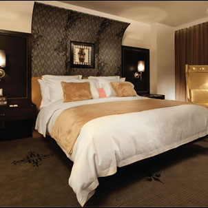
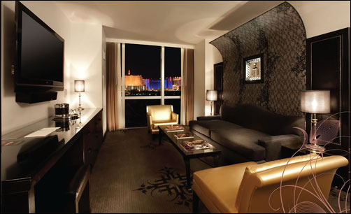
It also appears this room is a suite-like room, with a separate sitting area. Unlike the main building rooms, this room continues the look of the valet area to the tower buildings, with tones of black, white and various dark shades of grey. Gives the room an airy, yet sleek and modern vibe, I think. Though I can imagine the all-white bedding will be fun for housekeeping to keep clean.
The matching arc headboard and wall display in the sitting area are an unusual design touch, as are the matching pewter-like lighting fixtures. Random splashes of gold, in the seating and bedding, lend a touch of luxury to the color scheme. I also like the simplistic design in the carpeting, which is a far cry from the busy prints normally found in hotel flooring.
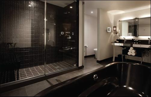
The bathroom is definitely built for two, unlike the standard bathroom in the original building, which I found almost too-small and cramped. A separate walk-in shower, spa bathtub and dual sinks are definitely large enough for a couple to share, and a partially separated toilet area is a nice touch, as well.

In fact, looking at the bathroom photo, the only thing I think would irk me is the lack of towel racks. I like to conserve hotel resources by letting a towel air dry and reusing it if I’m staying more than one night. Hard to do when there are no racks. Also, from a female point of view, the lighting seems a bit dark for applying makeup, but it could just be the photo itself.

These new towers, when completed will add 550 regular guest rooms and a all-suite VIP tower with 400 suites to the Hard Rock Hotel. These towers are slated for a late-Spring/early-Summer 2009 opening and are part of the multi-million dollar expansion and renovation project that will be ongoing through 2009.
What do you think of the new rooms? Sleek and sexy or too dark and masculine?